Many people think of code as artwork in some way or another and consider good code something of elegance and beauty. While working today, I came across another example of that in a visual representation of a project I’m working on.
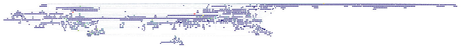
This image shows the call graph of the file I’m editing, which is one component of a much larger project. I made it with Python’s hotshot profiler and José Fonseca’s Gprof2dot. Brighter colors mean more time is spent in those functions or their children, although it’s hard to see at this size. Or does it show some sort of futuristic gun? Your call.
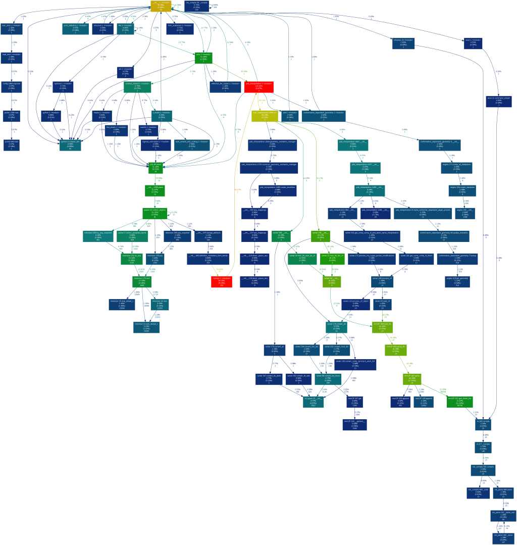
The above callgraph shows every single function, but here’s a profile generated with the same tools that shows only functions that use a certain percentage of time. You can actually see the colors:

This is amazing. Code always has some sort of underlying order and structure. It’s awesome to see it visually represented like this.
At first glance, I thought it was a slightly squished map of the world.
http://rtprof.sourceforge.net/ is pretty neat too.